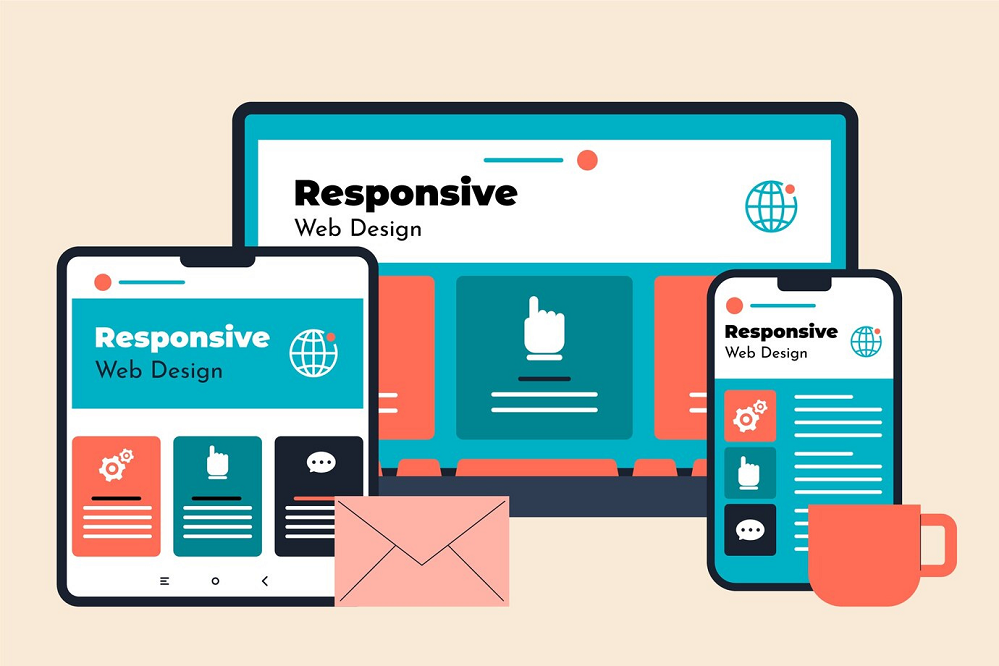
Mastering Mobile Responsiveness: Crafting a WordPress Theme
In the rapidly evolving digital landscape, where an ever-increasing number of users access the internet via mobile devices, having a responsive website is not just a good practice; it’s a necessity. Mobile responsiveness refers to the ability of a website to adapt and function seamlessly on screens of varying sizes, from the smallest smartphone to the largest desktop monitor.
This concept is not only about ensuring that your website looks good on mobile devices but also about providing an optimal user experience and, importantly, aligning with SEO best practices.
In this article, we will explore the art of crafting a responsive WordPress theme, focusing on how to make your website adaptable to different devices and screen resolutions while keeping your SEO objectives in mind.
The Importance of Mobile Responsiveness
To understand the importance of mobile responsiveness, one needs to look no further than the statistics. A significant portion of web traffic today comes from mobile devices. Whether it’s people shopping online, researching, or simply browsing for information, they are likely to do so from the convenience of their smartphones or tablets.
As a website owner or developer, this trend should be on your radar for multiple reasons, including:
Enhanced User Experience: A responsive website ensures that your visitors have a smooth and consistent experience regardless of their device. It means that your site is easy to navigate, content is readable, and interactions are intuitive.
Improved SEO Ranking: Search engines, particularly Google, favor mobile-friendly websites. In fact, Google uses mobile-first indexing, which means it primarily uses the mobile version of your site for ranking and indexing. A responsive website can significantly impact your SEO ranking.
Increased Conversion Rates: A better user experience often leads to higher conversion rates. Whether you’re selling products, services, or trying to capture leads, a responsive design can improve your chances of success.
Key Elements of a Responsive WordPress Theme
Creating a responsive WordPress theme, especially when transitioning from HTML to responsive WordPress, involves more than simply adjusting screen sizes. It’s about optimizing various elements of your website to provide an excellent experience across different devices..
Fluid Layouts
Instead of fixed-width layouts, use fluid layouts. These layouts expand and contract to fit the screen size, which is essential for responsiveness.
Flexible Images
Use CSS to ensure that images scale proportionally to fit the screen. Oversized images can slow down your site, so proper image optimization is key.
Scalable Typography
Ensure that text remains readable on all screen sizes. Use relative units like percentages for font sizes to make text responsive.
Mobile-Friendly Navigation
Implement mobile-friendly navigation menus, such as the “hamburger” menu, to ensure easy access to site content on small screens.
Touchscreen Compatibility
Consider touch gestures and interactions on mobile devices. Buttons and links should be appropriately sized and spaced for touchscreen users.
Cross-Browser Compatibility
Test your theme on various web browsers to ensure it displays consistently and correctly across different platforms.
Building a Responsive Grid System
A responsive grid system is the backbone of a mobile-friendly design. It provides a structured framework that allows your content to adapt to different screen sizes while maintaining a logical and visually pleasing layout. There are various ways to create responsive grids in WordPress:
Using CSS Grid: CSS Grid is a powerful tool for creating flexible grid layouts. It allows you to define columns and rows, which can adapt to different screen sizes.
Leveraging CSS Frameworks: Popular CSS frameworks like Bootstrap and Foundation come with built-in grid systems. These frameworks simplify the process of creating responsive designs, as they provide pre-defined grid classes that you can apply to your content.
Custom Grid Systems: If you prefer more control, you can create a custom grid system tailored to your specific project. This approach gives you the freedom to design a grid that perfectly suits your website’s needs.
CSS Frameworks for Responsiveness
CSS frameworks can significantly streamline the process of creating responsive WordPress themes. They come with pre-built styles, responsive grid systems, and a host of other useful components that make crafting a responsive design more accessible. Two of the most popular CSS frameworks are Bootstrap and Foundation.
Bootstrap
Bootstrap is a widely used, open-source CSS framework developed by Twitter. It offers a range of responsive design components, including a responsive grid system, pre-styled typography, and interactive components like modals and carousels. By integrating Bootstrap into your WordPress theme, you can ensure a consistent and mobile-responsive design foundation.
Foundation
Foundation is another robust CSS framework that’s known for its mobile-first approach. It provides a flexible grid system, responsive navigation options, and a variety of UI elements. Foundation’s focus on mobile responsiveness makes it an excellent choice for creating themes that prioritize adaptability across different devices.
Optimizing Images for Mobile
High-quality images can significantly enhance your website’s visual appeal, but they can also slow down your site if not optimized for mobile. Here are some essential image optimization practices for mobile responsiveness:
Compression
Compress your images to reduce their file sizes without compromising quality. Several tools and plugins are available for this purpose, such as Smush and TinyPNG.
Image Dimensions
Specify image dimensions in your HTML and CSS. This ensures that the browser allocates the correct space for the image, preventing layout shifts as images load.
Lazy Loading
Implement lazy loading for your images to defer the loading of off-screen images. This can significantly improve page load times, especially on mobile devices with limited bandwidth.
Image Formats
Choose the right image format. Use JPEG for photographs and images with many colors, and PNG for images with transparency or simple graphics.
Responsive Images
Use the srcset attribute in your image tags to provide different image sizes for different screen resolutions. Browsers can then select the most appropriate image to load.
Leveraging Media Queries
Media queries are a fundamental component of responsive web design. They allow you to apply different styles to your website based on the characteristics of the user’s device, such as screen width and orientation. Media queries are written in CSS and typically include conditions like minimum and maximum widths. For example:
css
Copy code
@media screen and (max-width: 600px) {
/* Styles for screens with a maximum width of 600px */
}
By using media queries, you can create responsive designs that adapt to various devices and screen sizes. This approach ensures that your content looks great and functions correctly on everything from large desktop monitors to small smartphone screens.
Ensuring a Seamless User Experience
A responsive website isn’t just about adjusting the layout; it’s about providing a seamless and enjoyable user experience on mobile devices. Here are some best practices to achieve this:
Mobile-Friendly Navigation
Mobile users have different navigation needs. Implement mobile-friendly navigation menus, such as the “hamburger” menu (the three horizontal lines), which condenses the menu options into a compact and easily accessible format.
Touchscreen Considerations
Recognize that many mobile users will interact with your website via touchscreens. Ensure that buttons and links are appropriately sized and spaced for touchscreen users, preventing accidental clicks on adjacent elements.
Simplified Forms
Optimize forms for mobile users by minimizing the number of input fields and using input types that are optimized for mobile, like date pickers and numeric keyboards for numerical input.
Load Speed
Mobile users often have slower internet connections, so prioritize loading speed. Minimize HTTP requests, optimize your CSS and JavaScript, and use browser caching to ensure that your site loads quickly on mobile devices.
Testing Your Mobile-Responsive WordPress Theme
Testing is a crucial part of the process. It’s essential to ensure that your responsive WordPress theme works correctly on a variety of devices and web browsers. Here’s how to test your theme effectively:
Device Testing
Test your theme on a range of devices, including smartphones, tablets, and different desktop screen sizes. Emulators and online testing tools can help you assess how your site appears on various devices.
Cross-Browser Compatibility
Test your theme on different web browsers, such as Google Chrome, Mozilla Firefox, Microsoft Edge, and Safari. Ensure that your site displays consistently and correctly across these platforms.
Performance Testing
Use performance testing tools like Google PageSpeed Insights and GTmetrix to evaluate your site’s loading speed and identify areas for improvement.
User Testing
Enlist users to test your website and gather feedback. This real-world input can help you identify any usability issues and make necessary adjustments.
SEO Benefits of Mobile Responsiveness
In addition to the user experience advantages, a mobile-responsive WordPress theme offers substantial SEO benefits. Search engines, particularly Google, consider mobile-friendliness as a ranking factor, and they prioritize mobile-first indexing. Here’s how mobile responsiveness impacts SEO:
Improved Ranking
Google rewards mobile-friendly websites with higher search engine rankings. If your site provides an excellent mobile experience, you’re more likely to appear at the top of search results.
Reduced Bounce Rate
A responsive design can lower your site’s bounce rate, as visitors are more likely to stay and engage with your content when it’s easy to read and navigate on mobile devices.
Faster Loading Speed
Mobile-responsive designs often load faster on mobile devices, another factor that search engines consider when ranking websites.
Enhanced User Engagement
Responsive designs encourage users to explore your site and spend more time on it, which is a positive signal for search engines.
Improved Click-Through Rates (CTR)
Sites that look good and function well on mobile devices tend to attract higher click-through rates in search engine results pages (SERPs).
Conclusion
Mastering mobile responsiveness is no longer an option but a requirement in today’s digital landscape. A responsive WordPress theme ensures that your website adapts to different devices and screen sizes, offering an optimal user experience. Additionally, it positively impacts your SEO ranking, making your site more visible to your target audience.
To convert Website to WordPress and ensure mobile responsiveness, crafting a mobile-responsive WordPress theme involves key elements like fluid layouts, flexible images, scalable typography, mobile-friendly navigation, touchscreen compatibility, and cross-browser compatibility. CSS frameworks like Bootstrap and Foundation can expedite the process, and image optimization and media queries are essential for a polished design.